Brand guide and stationery for Tadal Studio
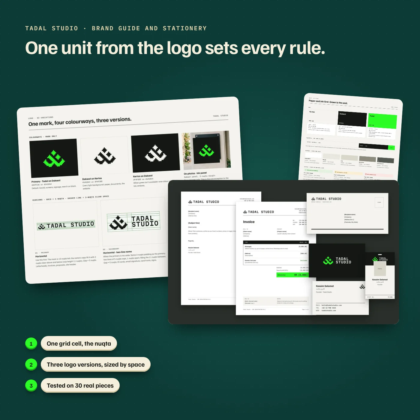
A short brand guide built on one unit taken from our own logo, so every card, invoice, sign and post we make follows the same few rules.
- Tadal Studio
- Web design and development
- Design project
- Brand guide, logo system, stationery and mockups
The problem
We had a logo and a colour, but no rules for using them. The green mark sat in a black tile on one page and straight on paper on the next, the name was set in three different sizes and spacings, and every new item (an invoice, a sign, a social post) started with the same questions. We tell clients that a brand only looks trustworthy when it looks the same everywhere, so we needed to prove it on our own studio first.
What we did
Measured the mark before changing anything. Our logo is the Jawi letters Ta and Dal drawn on a 21 × 15 pixel grid, so we made one grid cell, the nuqta, the unit for every rule: spacing, clear space and type size.
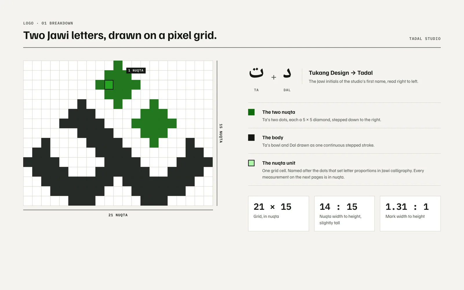
One cell of the logo's own grid sets every measurement in the guide. Cut the logo down to three versions. A horizontal lockup, a two-line lockup for tight spaces and the mark on its own, each with a minimum size, so choosing one is a matter of how much room there is, not taste.
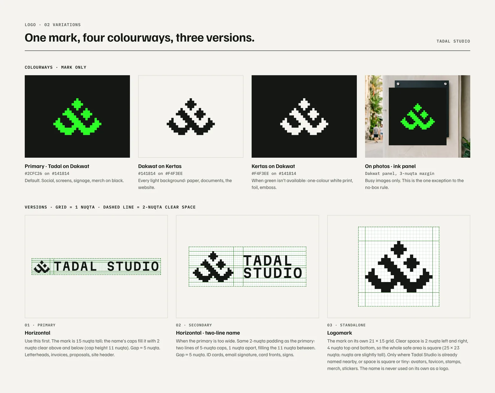
Primary, secondary and mark alone. Two layouts we tried were retired. Made green the exception. Pages are paper and ink, and the logo green is kept to about a tenth of any layout. We measured every colour pair: green on paper scores 1.3:1, so it is never used on a light background.
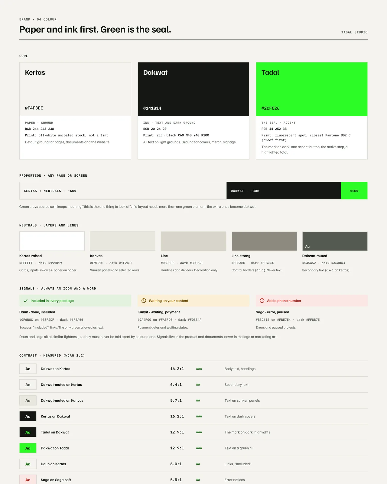
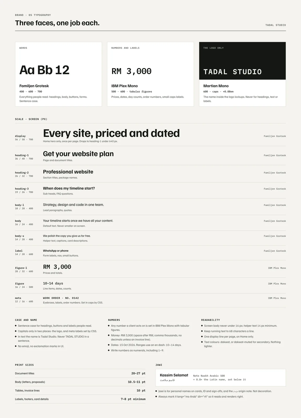
Contrast is measured, not judged by eye. Gave each typeface one job. One face for words, one for numbers and labels, and one used only inside the logo, so the name never turns up as a heading by accident.
Tested the rules on 30 real pieces. Letterhead, invoice, receipt, proposal cover, ID card, lanyard, tote, sign and more. Anything that kept needing exceptions, like a stacked logo that never balanced, was removed from the guide.
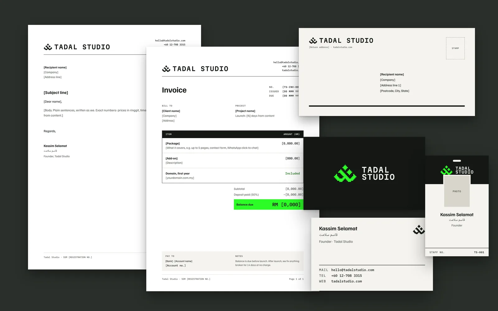
Names and phone numbers on these samples are placeholders.